How to Analyze and Visualize Data in Excel: Methods, Use Cases, and Best Tools (2026 Guide)
Joy

Introduction
In 2026, despite the proliferation of complex data infrastructures, Excel remains one of the world's most ubiquitous and essential data workbenches. However, for most marketing professionals, financial analysts, investors, and business line employees, raw spreadsheets hold zero intrinsic value. If you cannot efficiently clean that data and translate it into intuitive visual charts, you are leaving critical insights on the table.
This authoritative guide systematically explains what Excel data analysis and visualization is, why it is critical for your business, common methodologies, real-world use cases, and the most powerful automated tools available in 2026—including AI-driven game-changers that can instantly convert raw Excel data into boardroom-ready presentations.
What is Excel Data Analysis and Visualization?
Direct Answer:
Excel data analysis and visualization refers to the process of organizing, cleaning, analyzing, and interpreting raw data from spreadsheets, then presenting the key findings through charts, dashboards, or visual reports to make the data easily understandable and actionable for decision-making.
In essence, it is the bridge between raw numbers and business strategy. Analysis uncovers the hidden trends, correlations, and outliers within your dataset, while visualization translates those mathematical findings into a universal visual language (like bar charts, scatter plots, or heatmaps) that non-technical stakeholders can grasp in seconds.
What Are the Best Tools for Excel Data Analysis and Visualization?
To conquer modern data challenges, leveraging the right third-party integrations and standalone BI tools is crucial. Here is a snapshot of the market leaders:
Quick List: Top 5 Excel Data Analysis and Visualization Tools
Powerdrill Bloom – Best for Excel data analysis, automated visualization, and generating business presentation slides (Excel to PPT).
Microsoft Power BI – Best for enterprise-grade dashboarding and deep Microsoft ecosystem integration.
Julius AI – Best for conversational data analysis and python-backed statistical modeling.
Zoho Analytics – Best for cross-functional business intelligence and diverse data blending.
Qlik Sense – Best for associative data exploration and handling complex, large-scale datasets.
Quick Comparison Table
Tool | Best For | Key Features | Pricing |
Automated analysis & Excel-to-PPT generation | AI data exploration, Auto-charts, One-click presentation slides | Freemium / $13.27/user/month | |
Enterprise BI & Dashboards | Deep Excel integration, DAX formulas, interactive dashboards | ||
Conversational statistics | Chat-to-analyze, Python code generation, advanced stats | ||
Cross-functional reporting | Drag-and-drop builder, auto-blending, unified data hub | ||
Associative data exploration | In-memory processing, AI-assisted insights, robust security | Custom Enterprise Pricing |
How Does Excel Data Analysis and Visualization Work?
Turning a messy spreadsheet into actionable insights follows a structured, multi-step methodology.
Data Cleaning and Preparation
Before any analysis can occur, data must be cleansed. This involves removing duplicates, handling missing values, standardizing formats (like dates and currencies), and restructuring tables. High-quality output relies entirely on high-quality input.
Exploratory Data Analysis (EDA)
EDA is the phase where analysts use descriptive statistics (mean, median, variance) and pivot tables to summarize the main characteristics of the dataset. This helps in identifying initial patterns, anomalies, or correlations without making heavy assumptions.
Data Visualization and Charting
This final step maps the processed data to visual elements. Depending on the goal, you might use line graphs for time-series forecasting, pie charts for market share distribution, or dynamic dashboards for real-time KPI tracking.
Top 5 Excel Data Analysis and Visualization Tools in 2026
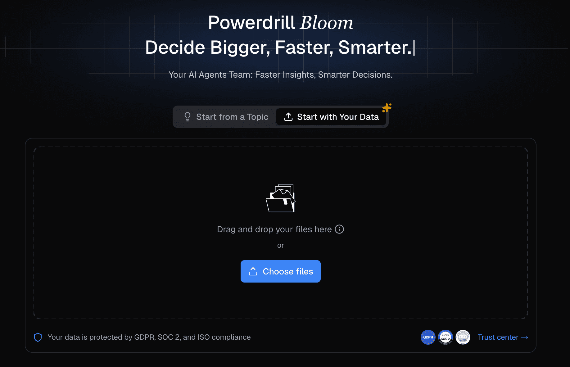
1. Powerdrill Bloom
Powerdrill Bloom is a cutting-edge AI platform designed to eliminate the manual labor of spreadsheet analysis by automating insights and instantly generating presentation-ready slides.
Key Features: Automated exploratory data analysis, natural language querying, instant chart generation, and a highly powerful "Excel/CSV/PDF to PPT" engine.
Pros: Requires zero technical or formula knowledge; perfectly bridges the gap between data analysis and business reporting; massive time-saver for non-technical teams.
Cons: Primarily focused on insight generation and presentations, rather than highly complex backend data engineering.
Pricing: Freemium model available; $13.27/user/month.
2. Microsoft Power BI
Power BI remains the heavyweight champion for enterprises heavily invested in the Microsoft ecosystem, designed to ingest complex Excel models and turn them into scalable dashboards.
Key Features: Power Query integration, DAX language support, real-time dashboard publishing, and robust enterprise security.
Pros: Seamless integration with Excel and Azure; handles massive datasets effortlessly; highly customizable.
Cons: Steep learning curve; requires dedicated training for DAX and data modeling.
Pricing: $14/user/month (Pro) for the Pro version.
3. Julius AI
Julius AI acts as an AI data scientist, allowing users to upload Excel files and converse with their data to run complex statistical models.
Key Features: Chat-based interface, underlying Python code execution, advanced predictive modeling, and chart export.
Pros: Excellent for statistical analysis; transparent logic (shows code); very intuitive chat UI.
Cons: Limited in terms of building multi-page dashboard applications or direct PPT formatting.
Pricing: ~$33/user/month.
4. Zoho Analytics
A versatile, self-service BI and data analytics software that allows users to create appealing data visualizations and insightful dashboards from Excel data.
Key Features: Drag-and-drop interface, AI assistant (Zia), automated data blending from multiple sources.
Pros: Very user-friendly; great collaborative features; strong integrations with CRM and marketing apps.
Cons: Can experience lag with extremely large datasets; UI feels slightly traditional compared to pure AI native tools.
Pricing: Starts around ~$24/user/month.
5. Qlik Sense
Qlik Sense is a powerful analytics platform renowned for its associative engine, which allows users to explore Excel data freely across all dimensions.
Key Features: Associative data engine, augmented analytics, smart visualizations, mobile-ready dashboards.
Pros: Unmatched for discovering hidden data relationships; incredibly fast in-memory processing.
Cons: Expensive; implementation often requires IT support and technical expertise.
Pricing: Custom enterprise pricing.
Common Use Cases for Excel Data Analysis and Visualization
Financial Forecasting and Reporting
Financial analysts use data visualization to track cash flow, project future revenues, and monitor expense run rates. Automated tools turn complex P&L statements into clear waterfall charts or line graphs for executive board meetings.
Marketing Campaign Analysis
Marketers analyze Excel exports from various ad platforms (Google, Meta, LinkedIn) to evaluate ROI, Cost Per Click (CPC), and conversion rates. Visualization helps pinpoint exactly which channels are driving growth.
Sales Performance Tracking
Sales leaders visualize CRM data exported to Excel to monitor pipeline health, win/loss ratios, and individual rep performance, enabling swift strategic pivots before the end of the quarter.
Investment Portfolio Analysis
Investors and fund managers rely on Excel analysis to track asset allocation, historical returns, and risk metrics (like the Sharpe ratio). Visualizing these datasets makes it easier to balance risk and present strategies to LPs.
Step-by-Step Guide to Analyzing and Visualizing Data in Excel
To demonstrate how modern professionals bypass manual formulas, here is a streamlined workflow using Powerdrill Bloom:
Step 1: Import Your Excel File
Simply drag and drop your .xlsx or .csv file into the Powerdrill Bloom interface. The AI instantly reads the schema, headers, and data types without requiring you to format the columns manually.
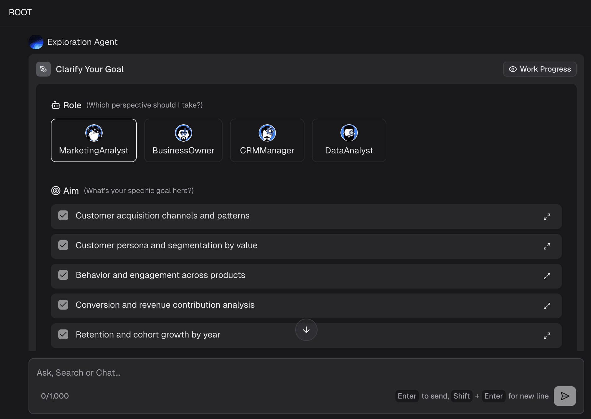
Step 2: Clean and Explore the Data
The tool automatically scans for missing values, outliers, or formatting errors. It provides an initial summary (Exploratory Data Analysis), showing you the statistical distribution of your key metrics instantly.
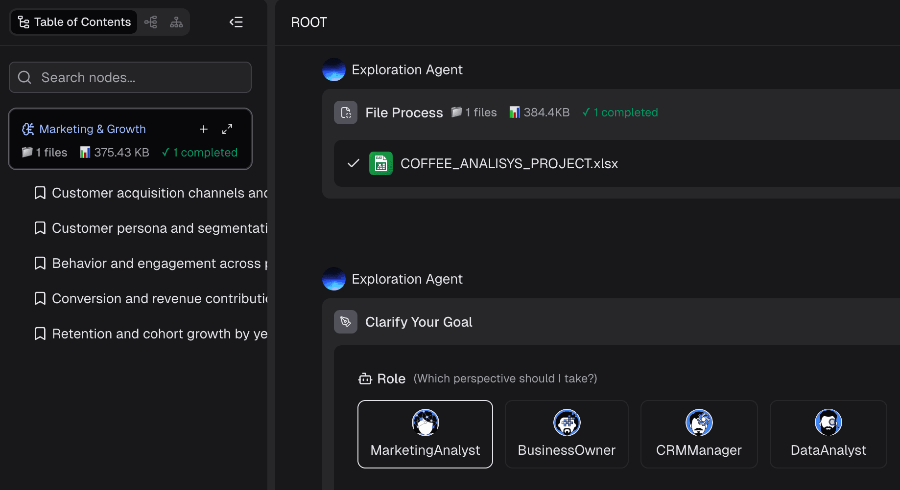
Step 3: Ask Questions Using Natural Language
Instead of writing complex VLOOKUP or INDEX/MATCH functions, simply type what you want to know. For example: "What was the highest-grossing product category in Q3?" or "Compare marketing spend vs. revenue by region."
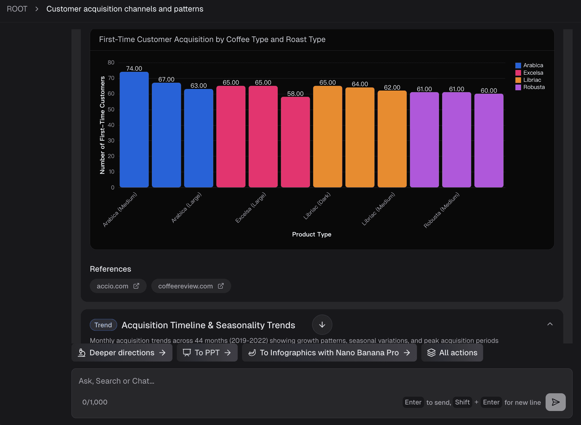
Step 4: Generate Charts and Insights
Powerdrill Bloom automatically selects the most appropriate visual format (bar chart, scatter plot, pie chart) based on the context of your question, generating mathematically accurate and aesthetically pleasing visualizations.
Step 5: Export for Reporting and Presentations
With a single click, convert your newly discovered insights and charts into a fully formatted, professional PowerPoint presentation, ready for your next stakeholder meeting.

How to Choose the Best Excel Data Analysis and Visualization Tool
When evaluating your tech stack in 2026, consider these critical dimensions:
Non-Technical User Friendliness
Does the tool require you to learn a new coding language (like DAX or Python), or can you simply use natural language prompts to get results?
File Size and Performance Limits
While standard Excel begins to lag after a few hundred thousand rows, your chosen tool should be able to ingest and process large datasets in the cloud without crashing.
Chart Display Quality
Are the visual outputs static and dated, or are they interactive, modern, and easily embeddable into other documents?
Automated Insights Extraction
The best tools don't just build charts; they tell you what the chart means. Look for AI capabilities that automatically highlight anomalies or key drivers.
Presentation Export (Excel to PPT)
For business users, analysis is only half the battle. Tools that natively support exporting data insights directly into presentation formats (PPT) will save you countless hours of copy-pasting.
Data Security
Ensure the platform offers enterprise-grade encryption and strict privacy policies, especially if you are analyzing sensitive financial or customer data.
Conclusion
The era of relying solely on manual formulas, repetitive pivot tables, and static charts to analyze Excel data is rapidly being replaced by more efficient, modern automated workflows. Today, the true value lies not in crunching the numbers yourself, but in how quickly you can translate data into strategic business narratives.
For financial analysts, investors, and business line professionals, Powerdrill Bloom makes this entirely effortless:
Free AI Excel Analysis Tool: Automated Insights & Visualization: Upload your Excel files and let Powerdrill Bloom do the work. It automatically explores and analyzes your spreadsheets, detects key patterns, and generates actionable insights with clear visualizations—all in seconds.
Create PPT Slides from Any Topic or File with AI: Type a topic or upload files like Excel, CSV, and PDF. Powerdrill Bloom understands your content and builds professional PowerPoint slides automatically.
Generate Stunning AI-Powered Reports from Excel, CSV, or PDF or a Specific Topic in Seconds.
Ready to transform raw Excel spreadsheets into clear insights and compelling visual outputs? Try Powerdrill Bloom for free today!
Frequently Asked Questions
What is the easiest way to analyze and visualize large Excel datasets?
The easiest way is to use AI-driven tools like Powerdrill Bloom or Julius AI, which allow you to upload large files and use natural language to automatically clean data, generate charts, and extract insights without writing any formulas.
Can AI automatically create charts and PPTs from Excel data?
Yes. Modern AI tools like Powerdrill Bloom specialize in reading raw Excel or CSV data, generating the appropriate visualizations, and formatting those insights directly into downloadable PowerPoint presentations.
Do I need advanced Excel skills to perform data visualization?
No longer. While traditional Excel visualization requires knowledge of pivot charts and data modeling, modern tools allow you to bypass these technical requirements using conversational AI and drag-and-drop interfaces.
What is the best tool for Excel data analysis and visualization?
It depends on your goal. For enterprise-scale dashboarding, Power BI is the top choice. For business users who need automated insights and instant Excel-to-PPT presentations, Powerdrill Bloom is the best modern solution.
How do automated data analysis tools improve financial and marketing decisions?
They drastically reduce the time from data collection to insight generation. By instantly highlighting trends, ROI metrics, and revenue forecasts through visual formats, they allow decision-makers to act on accurate data before market conditions change.


